Michael Giberson
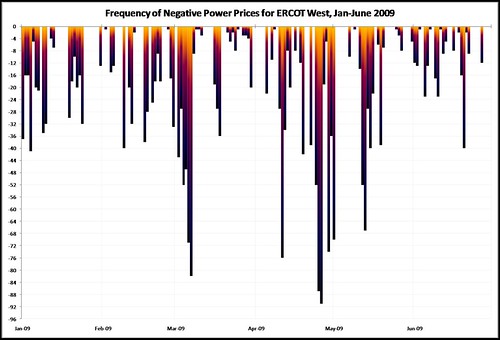
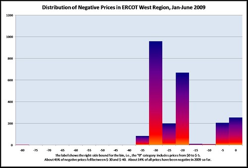
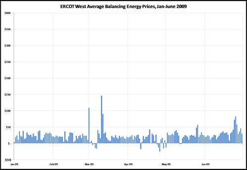
Below are three charts showing data on ERCOT West zone power prices for the January-June 2009 period. The charts were derived from data provided through the ERCOT website, on their “Balancing Energy Services Market Clearing Prices for Energy Annual Report” page.
These charts were prepared in the same way, including use of the same axis scale, as earlier charts showing 2008 data in order to make comparison easier. As discussed in this post published earlier today, average power prices are lower in 2009 than they were in 2008, but prices have gone negative less frequently this year due to the more frequent use of non-price methods of managing grid congestion.
As the histogram chart below shows when compared to its 2008 counterpart, when prices have become negative in 2009 they haven’t been quite so negative as before (likely also due to the congestion management methods used). Last year about 70 percent of the negative prices were $-30 MWh or below. So far in 2009 the comparable number is only 44 percent.


Pingback: 2009 power prices in ERCOT’s West zone: a mix of wind power, natural gas prices, transmission constraints, and (inefficient) congestion management practices « Knowledge Problem