Lynne Kiesling
Thursday’s Wall Street Journal had an article on airline fuel economy, “A Prius With Wings vs. a Guzzler in the Clouds“, and it presents an analysis that is a good starting point for thinking about an economic comparison of the fuel efficiency of different modes of transportation. The analysis compares the fuel economy of different U.S. airlines, measured in miles per gallon to facilitate comparisons with other modes of transportation: “With airlines, it’s how far one seat (occupied or not) can travel on one gallon of jet fuel.”.
One technical caveat: the measure of m.p.g. uses the number of seats in the airline’s fleet, not the number of occupied seats. Thus if the airline has a low load factor (i.e., flies planes with lots of empty seats), then this measure will overstate their fuel economy relative to what it would be if you measured actual passenger miles flown. Motivated by competition, costs, and narrowing profit margins, though, airlines have had pretty high load factors since deregulation in 1978, so I wouldn’t throw out this analysis based on that caveat.
Two interesting results come out of the analysis. First,
The three worst major U.S. carriers for fuel efficiency happen to be the three biggest: Delta, American and United airlines. They fly the biggest planes, which aren’t always more fuel efficient, and they have the oldest fleets.
Best in fuel economy: Alaska Airlines, jetBlue Airways and Continental Airlines, which all have fleets that average nine years of age or younger. Regardless of an airline’s ranking, your particular flight mpg will vary greatly.
So newer planes are more fuel efficient, and even though larger planes can carry many more passengers, the incremental fuel burned per additional passenger is higher. I’d be interested in seeing an econometric analysis that decomposed the magnitudes of the age effect and the size effect.
Second, note that the average fuel economy for the entire U.S. air fleet is 64 m.p.g. That’s high! Even if you take into account the load factor caveat, that’s an impressive number, as is the improvement in fuel economy that the airlines have generated since 2000 (motivated, certainly, by increases in jet fuel prices and jet fuel price volatility that they can’t hedge fully).
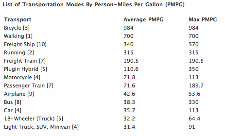
Comparing the fuel efficiency of different modes of passenger transportation is difficult, but this recent post at truecostblog makes a thorough stab at an apples-to-apples comparison of actual passenger miles per gallon, a measure that takes into account average vehicle occupancy and actual vehicle miles traveled, not just passenger capacity. This measure will disfavor the personal car, which for most of us most of the time operates with a load factor of 25% (single drivers). Truecostblog’s results:

Each of the calculation is supported by notes, so please check the original post to get further details on the calculations.
Note here that the estimate of the airplane mpg is 42.6, with the decrease relative to the WSJ analysis reflecting the load factor of 79.6%. Passenger trains compare favorably, despite the poor utilization/load factor of Amtrak in the US. But what’s really striking here is how poorly the bus, the car, and the SUV/minivan compare to the airplane and train.
As an aside, note also that these data support all of those CSX commercials we’ve been seeing where CSX trumpets how green it is to ship freight by train rather than truck — the freight train 190.5 PMPG vs. the 18-wheeler 32.2 PMPG.

I think the table is a great seminal data set … but it is really akin to NPV in finance. To get a better handle on the value of transportation, something like this needs to incorporate option valuation.
All of the top items on the list would lose a lot of value if viewed as options: 1) you either can’t transport much extra if the need arises (walking and running), or 2) you’re limited in the available destinations (ships, trains, and for now, hybrids).
Pingback: Endangered Stories
Very interesting post, but just the tip of the iceberg.
Load factor is an extremely important factor of energy use per person mile traveled, or per ton mile of freight transported. It is that factor that I think makes energy use by public transit systems so wasteful. While our mental models assume the typical light rail train, city bus, or subway is jamed full at rush hour, the average condition is many tons of metal running their fixed routes with few people on board.
Another inmportant factor for energy efficiency which is not captured in this article is the amount of infrastructure required to support the travel. Air travel does very well in this aspect. I suspect water based transport comes next, then automobile/trucks, followed by steel rail based transportation.
In the biking/walking sector I would guess that walking/running require less infrastructure than biking. I think we should assume the load factors are always 1.0 in these modes.
Are those intercity buses or transit buses? That makes a world of difference. Intracity transport is always less efficient, which puts intracity vehicles at a disadvantage. This is a big disadvantage for cars too in the analysis: they are primarily used for intracity transit.